Technical Analysis for Traders: A Complete 2026 Guide
Technical analysis is the discipline of forecasting future price movements by studying historical market data, primarily price and volume. Unlike fundamental analysis, which evaluates a company's financial health or an economy's macroeconomic indicators, technical analysis operates on three core assumptions: the market discounts everything, prices move in trends, and history tends to repeat itself. Whether you trade forex, stocks, commodities, or indices on MetaTrader 5, understanding technical analysis gives you a structured framework for identifying high-probability trade setups, managing risk, and timing entries and exits with precision. This guide walks you through every essential concept, from reading your first candlestick chart to deploying advanced indicator combinations in Pulsar Terminal.
Technical analysis is the discipline of forecasting future price movements by studying historical market data, primarily price and volume. Unlike fundamental analysis, which evaluates a company's financial health or an economy's macroeconomic indicators, technical analysis operates on three core assumptions: the market discounts everything, prices move in trends, and history tends to repeat itself. Whether you trade forex, stocks, commodities, or indices on MetaTrader 5, understanding technical analysis gives you a structured framework for identifying high-probability trade setups, managing risk, and timing entries and exits with precision. This guide walks you through every essential concept, from reading your first candlestick chart to deploying advanced indicator combinations in Pulsar Terminal.
Key Takeaways
- Technical analysis is the study of past market data, primarily price and volume, to forecast future price direction. It ...
- Candlestick charts are the most popular chart type among traders because they convey four critical data points in a sing...
- Support(/glossary/support) and resistance(/glossary/resistance) are the most fundamental concepts in technical analysis....
1What Is Technical Analysis and Why It Works
Technical analysis is the study of past market data, primarily price and volume, to forecast future price direction. It traces its roots to Charles Dow's work in the late 1800s, and the principles he established still form the foundation of modern chart analysis.
The approach rests on three axioms. First, the market discounts everything: all known information, from central bank policy to trader sentiment, is already reflected in the current price. Second, prices move in trends: once a trend is established, it is more likely to continue than to reverse. Third, history repeats itself: human psychology drives recognizable patterns that recur across markets and timeframes.
Technical analysis works because markets are driven by human participants who react to fear, greed, and uncertainty in predictable ways. When thousands of traders watch the same support level on EUR/USD at 1.0800, their collective buy orders at that level create a self-fulfilling prophecy. This is not mysticism; it is crowd psychology expressed through price.
Critics argue that past price data cannot predict the future. While no method guarantees profits, technical analysis provides a probabilistic edge. A trader who consistently identifies setups with a 55% win rate and a 2:1 reward-to-risk ratio will be profitable over hundreds of trades. The edge is not in any single trade but in the statistical consistency of the approach.
Technical analysis is also timeframe-agnostic. The same candlestick patterns and indicator signals that work on a daily EUR/USD chart apply to a 5-minute scalping chart on NASDAQ. This universality makes it the most widely used analytical framework among retail and institutional traders alike. Combined with sound risk management, it provides a repeatable, rules-based system for navigating any market condition.
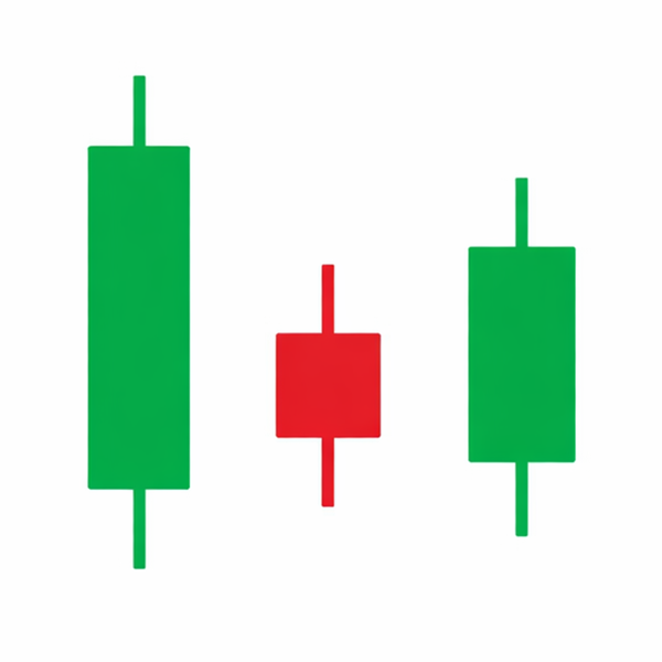
2Reading Candlestick Charts
Candlestick charts are the most popular chart type among traders because they convey four critical data points in a single visual element: the open, high, low, and close of each time period. A bullish (green or white) candle forms when the close is above the open, while a bearish (red or black) candle forms when the close is below the open. The filled or colored rectangle is called the body, and the thin lines extending above and below it are the upper and lower wicks (or shadows).
Single-candle patterns provide immediate insight into market sentiment. A doji, where the open and close are virtually identical, signals indecision. A hammer at the bottom of a downtrend, with a long lower wick and small body near the top, suggests buyers stepped in aggressively to reject lower prices. Conversely, a shooting star at the top of an uptrend signals potential reversal as sellers pushed price down from the highs.
Multi-candle patterns are even more powerful. The engulfing pattern occurs when a candle's body completely engulfs the previous candle's body. A bullish engulfing at support on GBP/USD 1.2650 is a strong buy signal, especially when confirmed by rising volume. The morning star is a three-candle reversal pattern: a bearish candle, followed by a small-bodied candle (the star), followed by a bullish candle that closes well into the first candle's body.
The evening star is the bearish counterpart, appearing at the top of uptrends. Three white soldiers (three consecutive bullish candles with higher closes) confirm strong buying momentum, while three black crows signal aggressive selling.
Context matters enormously when reading candlesticks. A hammer at a major support level on the daily chart carries far more weight than a hammer in the middle of a range on a 1-minute chart. Always combine candlestick analysis with key levels, volume, and the broader trend for the most reliable signals.
“Support and resistance are the most fundamental concepts in technical analysis.”
3Support and Resistance Levels
Support and resistance are the most fundamental concepts in technical analysis. Support is a price level where buying pressure consistently overcomes selling pressure, causing price to bounce upward. Resistance is a level where selling pressure overwhelms buyers, causing price to reverse downward. These levels form because traders have collective memory: prices where significant reversals occurred in the past attract attention again in the future.
Identifying strong levels requires looking for areas where price has reversed at least two or three times. The more touches a level has, the more significant it becomes. For example, if USD/JPY has bounced off 148.50 four times over the past three months, that level represents strong support with substantial buy orders clustered around it.
A critical principle is role reversal: when support breaks, it often becomes resistance, and vice versa. If EUR/USD breaks below support at 1.0800, that level frequently acts as resistance on any subsequent retest. Traders who bought at 1.0800 and are now underwater will look to sell at breakeven, creating selling pressure at the former support.
Support and resistance are best understood as zones rather than exact prices. Instead of marking 1.0800 as a single line, treat 1.0785 to 1.0815 as a support zone. This accounts for the natural variation in how different market participants place their orders.
Round numbers (1.1000, 150.00, 2000.00 on gold) act as psychological support and resistance because traders cluster orders at these levels. Institutional traders know this and often place orders just beyond round numbers to trigger stop-loss clusters before the real move begins.
When a support or resistance level is tested and holds, it strengthens. When it breaks convincingly with strong volume and a full candle close beyond it, the breakout often leads to an impulsive move as trapped traders exit their positions. Always wait for confirmation, such as a close above resistance rather than just a wick through it, before acting on a breakout.
4Trend Analysis and Trendlines
A trend is the overall direction in which a market is moving. An uptrend is defined by a series of higher highs and higher lows. A downtrend is characterized by lower highs and lower lows. A sideways or ranging market shows no clear directional bias, with price oscillating between horizontal support and resistance.
Trendlines are the simplest tool for visualizing trends. An ascending trendline connects two or more swing lows in an uptrend. A descending trendline connects two or more swing highs in a downtrend. The more times price touches and respects a trendline, the more valid it becomes. A trendline with three or more touches is considered established and reliable.
Drawing trendlines effectively requires connecting the most obvious swing points. Avoid forcing a trendline to fit. If you have to stretch or adjust it significantly, the line probably does not represent the true trend. Use candle bodies rather than wicks for a cleaner line, though both methods have their proponents.
Trend channels add a parallel line on the opposite side of the trendline, creating a channel that captures the full range of price movement. In an ascending channel on AUD/USD, traders buy near the lower trendline and take profits near the upper channel line. A break below the lower trendline signals a potential trend reversal.
The concept of trend hierarchy is essential for multi-timeframe analysis. The monthly chart might show a strong uptrend, the daily chart a corrective pullback, and the 4-hour chart a short-term downtrend within that pullback. Professional traders align their trades with the higher-timeframe trend direction. Trading pullbacks within a daily uptrend on the 1-hour chart, for instance, offers higher-probability setups than trying to catch reversals against the dominant trend.
Trend exhaustion signals include flattening trendline slope, shrinking candle bodies near highs, and bearish divergences on momentum indicators. Recognizing when a trend is losing steam is just as important as identifying its beginning.
“Moving averages smooth out price data to reveal the underlying trend direction.”
5Moving Averages: SMA, EMA, and Crossovers
Moving averages smooth out price data to reveal the underlying trend direction. The Simple Moving Average (SMA) calculates the arithmetic mean of prices over a specified number of periods. The 50-day SMA, for example, adds the last 50 closing prices and divides by 50. The Exponential Moving Average (EMA) gives more weight to recent prices, making it more responsive to current market conditions.
The most widely watched moving averages are the 20 EMA (short-term trend), the 50 SMA or EMA (medium-term trend), and the 200 SMA (long-term trend). When price is above the 200 SMA, the market is generally considered to be in a long-term uptrend. Institutional traders and fund managers monitor the 200-day SMA closely, and its support or resistance effect is well documented across forex, equities, and commodities.
Moving average crossovers generate trading signals. The golden cross occurs when the 50 SMA crosses above the 200 SMA, signaling a bullish trend shift. The death cross is the opposite: the 50 SMA crosses below the 200 SMA, indicating bearish momentum. While these signals lag by nature, they are effective at confirming major trend changes. For instance, the golden cross on S&P 500 in late 2023 preceded a sustained rally through 2024.
Shorter-term crossovers, such as the 9 EMA crossing the 21 EMA, provide more frequent signals suitable for swing trading. When the 9 EMA crosses above the 21 EMA on the 4-hour EUR/USD chart, and price is above the 200 SMA on the daily chart, that confluence creates a high-probability long setup.
Moving averages also serve as dynamic support and resistance. During strong uptrends, price often pulls back to the 20 or 50 EMA before resuming higher. Traders use these pullbacks as entry points, placing stop-losses just below the moving average. The key is to use moving averages as part of a broader framework rather than relying on them in isolation. Combine them with candlestick confirmation, volume analysis, and key horizontal levels for the best results.
6RSI and Momentum Oscillators
The Relative Strength Index (RSI) is a momentum oscillator that measures the speed and magnitude of recent price changes on a scale from 0 to 100. Developed by J. Welles Wilder in 1978, it remains one of the most widely used technical indicators. The standard setting is 14 periods. Readings above 70 indicate overbought conditions, while readings below 30 indicate oversold conditions.
However, overbought does not automatically mean sell, and oversold does not automatically mean buy. In strong uptrends, RSI can remain above 70 for extended periods. During the 2024 gold rally from $2,000 to $2,400, RSI stayed above 60 for weeks. A more effective approach is to use RSI for identifying potential reversals at key support and resistance levels. When EUR/USD reaches resistance at 1.1200 and RSI simultaneously shows a reading above 75, the probability of a reversal increases significantly.
RSI divergence is one of the most powerful signals in technical analysis. Bullish divergence occurs when price makes a lower low but RSI makes a higher low, indicating that downward momentum is weakening despite new price lows. Bearish divergence occurs when price makes a higher high but RSI makes a lower high. Hidden divergence signals trend continuation: in an uptrend, price makes a higher low while RSI makes a lower low, suggesting the trend will resume.
The Stochastic Oscillator is another popular momentum tool, comparing the closing price to its price range over a given period. The %K line (fast) and %D line (slow, a moving average of %K) generate signals when they cross in overbought or oversold zones. Stochastic works exceptionally well in ranging markets but produces false signals during strong trends.
For more robust momentum analysis, explore additional indicators and consider combining RSI with trend-following tools. Use RSI on higher timeframes (daily, weekly) for more reliable signals, and on lower timeframes (1-hour, 15-minute) for precise entry timing within a higher-timeframe setup.
“The Moving Average Convergence Divergence (MACD) is a trend-following momentum indicator that shows the relationship between two moving averages of price.”
7MACD and Signal Lines
The Moving Average Convergence Divergence (MACD) is a trend-following momentum indicator that shows the relationship between two moving averages of price. The standard MACD uses the 12-period EMA minus the 26-period EMA to produce the MACD line. A 9-period EMA of the MACD line creates the signal line. The histogram displays the difference between the MACD line and the signal line, providing a visual representation of momentum.
The primary MACD signal occurs when the MACD line crosses above the signal line (bullish) or below it (bearish). When the MACD line crosses above the signal line while both are below the zero line, this signals a potential trend reversal from bearish to bullish. A MACD crossover above the zero line confirms that bullish momentum is accelerating. For example, when USD/CAD shows a bullish MACD crossover on the daily chart while price bounces off support at 1.3500, the confluence supports a long position.
The MACD histogram provides early warning of momentum shifts. When the histogram bars are shrinking (becoming shorter), it indicates that the current momentum is weakening even before a crossover occurs. Traders who watch the histogram can anticipate crossover signals and prepare their entries.
MACD divergence follows the same principle as RSI divergence but is often considered more reliable for swing trading because MACD inherently factors in trend direction. Bearish divergence on the weekly MACD, where price makes a higher high but MACD makes a lower high, has historically preceded significant corrections in major currency pairs and equity indices.
A common mistake is using MACD in isolation during choppy, ranging markets. The indicator was designed for trending conditions and will produce numerous whipsaw signals when price is moving sideways. Filter MACD signals by first confirming the market is trending using the ADX indicator (readings above 25 suggest a trend) or by checking whether price is respecting a clear trendline.
Advanced traders adjust MACD settings based on their trading style. Shorter settings like 8, 17, 9 generate faster signals for day trading, while longer settings like 19, 39, 9 reduce noise for position trading. Explore the full range of technical indicators to find the combination that suits your strategy.
8Bollinger Bands and Volatility
Bollinger Bands, created by John Bollinger in the 1980s, consist of three lines: a 20-period simple moving average (the middle band), an upper band plotted two standard deviations above the SMA, and a lower band plotted two standard deviations below it. The bands expand and contract based on market volatility, making them one of the most effective tools for measuring and trading volatility cycles.
The Bollinger Squeeze is one of the most actionable signals this indicator produces. When the bands contract to their narrowest width in several weeks or months, it indicates a period of unusually low volatility. Low volatility always precedes high volatility. When GBP/JPY bands squeeze tight on the daily chart, traders prepare for a breakout move. The direction of the breakout determines the trade: a close above the upper band favors longs, while a close below the lower band favors shorts.
Bollinger Bands also help identify overbought and oversold conditions within the context of the current trend. In a strong uptrend, price tends to walk along the upper band, with pullbacks finding support at the middle band (20 SMA). Buying at the middle band during an uptrend and targeting the upper band is a classic mean-reversion strategy that works across all liquid markets.
The %B indicator, derived from Bollinger Bands, shows where price sits relative to the bands. A %B value above 1.0 means price is above the upper band; below 0.0 means price is below the lower band. Values between 0.0 and 1.0 indicate the position within the bands. This quantifies what the visual bands show and enables systematic strategy rules.
Bandwidth, calculated as (Upper Band minus Lower Band) divided by Middle Band, measures the width of the bands as a percentage. When Bandwidth reaches its lowest point in six months, the probability of a significant directional move in the coming days increases substantially. Combining the Bandwidth squeeze with a breakout confirmation candle and volume surge creates a high-probability setup that works on forex, stocks, and commodities alike.
“Fibonacci retracements are horizontal lines drawn at key ratios derived from the Fibonacci sequence: 23.6%, 38.2%, 50%, 61.8%, and 78.6%.”
9Fibonacci Retracements
Fibonacci retracements are horizontal lines drawn at key ratios derived from the Fibonacci sequence: 23.6%, 38.2%, 50%, 61.8%, and 78.6%. These levels identify potential areas where price may retrace before continuing in the direction of the original trend. The 61.8% level, known as the golden ratio, is the most widely observed and often produces the strongest reactions.
To draw Fibonacci retracements, identify a significant swing low and swing high in an uptrend (or swing high to swing low in a downtrend). The tool then projects the retracement levels between these two points. In a healthy uptrend, price typically retraces to the 38.2% or 50% level before resuming higher. Deeper retracements to 61.8% suggest the trend may be weakening but is not yet broken.
For a practical example, consider gold rallying from $2,150 to $2,450. The 38.2% retracement sits at $2,335, the 50% retracement at $2,300, and the 61.8% retracement at $2,265. If gold pulls back and finds support at $2,300 with a bullish engulfing candle, that confluence of the 50% Fibonacci level and a reversal candlestick pattern provides a high-probability long entry.
Fibonacci extensions project potential profit targets beyond the original move. The 127.2% and 161.8% extensions are the most commonly used. After a retracement completes and price resumes the trend, these extension levels indicate where the next wave might exhaust. If EUR/USD retraces from 1.1200 to 1.1050 (finding support at the 61.8% level of the prior swing) and resumes higher, the 127.2% extension of the retracement move projects a target near 1.1240.
Fibonacci levels work best when they confluence with other technical factors. A 61.8% retracement that aligns with a previous support level, a rising 50 EMA, and an RSI reading near 40 in an uptrend creates a powerful cluster of evidence. The more independent factors that agree at a single price zone, the higher the probability that the level will hold. Avoid using Fibonacci in isolation; it is a confluence tool, not a standalone system.
10Chart Patterns: Head and Shoulders, Double Top/Bottom, and Triangles
Chart patterns are geometric formations that appear on price charts and signal either trend continuation or reversal. Recognizing these patterns gives traders a framework for anticipating future price movement and calculating measured targets.
The Head and Shoulders pattern is the most reliable reversal formation in technical analysis. It consists of three peaks: a left shoulder, a higher head, and a right shoulder that is roughly equal in height to the left shoulder. The neckline connects the lows between the shoulders. A break below the neckline confirms the reversal, and the measured target equals the distance from the head to the neckline, projected downward from the breakout point. When EUR/USD forms a head and shoulders on the daily chart with a neckline at 1.0900 and a head at 1.1100, the projected target after a neckline break is 1.0700 (200 pips).
Double tops and double bottoms are two-peak (or two-trough) reversal patterns. A double top forms when price reaches the same resistance level twice and fails to break through, creating an M-shaped pattern. The confirmation comes when price breaks below the swing low between the two peaks. Double bottoms are the bullish counterpart, forming a W shape at support. These patterns are common on all timeframes and are particularly reliable on the 4-hour and daily charts.
Triangles are continuation patterns that form when price consolidates into a tightening range. Symmetrical triangles show converging trendlines with no directional bias and typically break in the direction of the prior trend. Ascending triangles have a flat resistance level with rising lows, indicating buying pressure, and usually break upward. Descending triangles have flat support with falling highs and typically break downward.
Flags and pennants are short-duration continuation patterns that form after strong impulsive moves. A bull flag is a small downward-sloping channel that forms after a sharp rally. The breakout above the flag projects a target equal to the length of the flagpole (the preceding impulsive move). These patterns appear frequently in trending markets and offer excellent risk-to-reward ratios when traded with proper strategies.
“Volume measures the number of shares, contracts, or lots traded during a given period.”
11Volume Analysis
Volume measures the number of shares, contracts, or lots traded during a given period. It is the fuel that drives price movement, and analyzing volume alongside price provides crucial confirmation of the strength or weakness of a move. In forex, true volume data is not available from a single exchange, but tick volume (the number of price changes per period) serves as a reliable proxy and correlates closely with actual volume.
The core principle of volume analysis is straightforward: strong moves should be accompanied by strong volume. When EUR/USD breaks above resistance at 1.1200 with a significant spike in volume, the breakout is far more likely to sustain than a breakout on thin volume. Low-volume breakouts frequently result in false breakouts and traps.
Volume divergence is as informative as price-indicator divergence. If gold is making new highs but each successive high is accompanied by declining volume, the uptrend is losing participation and may be nearing exhaustion. Conversely, if a stock is making new lows on decreasing volume, the selling pressure is drying up and a reversal may be approaching.
The Volume Weighted Average Price (VWAP) is an intraday benchmark that calculates the average price weighted by volume. Institutional traders use VWAP as a reference for execution quality. When price is above VWAP, the intraday bias is bullish. When price pulls back to VWAP and bounces, it confirms institutional buying interest.
On-Balance Volume (OBV) is a cumulative volume indicator that adds volume on up days and subtracts volume on down days. Rising OBV confirms an uptrend, while a divergence between rising price and falling OBV warns of potential trend weakness. OBV breakouts above their own resistance levels often precede price breakouts, giving traders an early warning signal.
Climactic volume, an extreme volume spike often seen at the end of a trend, signals exhaustion. If USD/JPY has been falling for weeks and then prints the highest volume bar of the move alongside a bullish hammer candle, that climactic volume event often marks the selling climax and the beginning of a reversal or consolidation phase.
Frequently Asked Questions
Q1What is the difference between technical analysis and fundamental analysis?
Technical analysis studies historical price and volume data to forecast future price movements, relying on chart patterns, indicators, and statistical tools. Fundamental analysis evaluates the intrinsic value of an asset by examining economic data, earnings reports, interest rates, and geopolitical factors. Technical analysis focuses on 'what' the price is doing, while fundamental analysis asks 'why.' Many successful traders combine both approaches, using fundamentals to determine the direction and technicals to time their entries and exits.
Q2Which technical indicators are best for beginners?
Beginners should start with three core indicators: Moving Averages (the 50 and 200 SMA) for trend identification, RSI (14-period) for momentum and overbought/oversold conditions, and support and resistance levels drawn manually on the chart. These three tools cover trend direction, momentum, and key price levels. Avoid loading your chart with too many indicators at once, as conflicting signals create confusion. Master these basics first, then gradually add MACD or Bollinger Bands as your understanding deepens.
Q3How many indicators should I use at the same time?
Professional traders typically use two to four indicators that serve different purposes. A good combination includes one trend indicator (such as a moving average), one momentum oscillator (like RSI or MACD), and volume analysis. Using multiple indicators from the same category, for example RSI and Stochastic together, creates redundancy and does not add meaningful information. The goal is confluence: when independent tools agree on a signal, the probability of success increases significantly.
Q4Does technical analysis work on all timeframes?
Yes, technical analysis principles apply across all timeframes, from 1-minute scalping charts to monthly position trading charts. However, higher timeframes (daily, weekly) produce more reliable signals because they contain more data points and are less affected by market noise. A head and shoulders pattern on the weekly EUR/USD chart carries far more significance than the same pattern on a 5-minute chart. Many traders use multi-timeframe analysis, identifying the trend on the daily chart and timing entries on the 1-hour or 4-hour chart.
Q5What is the most reliable chart pattern?
The head and shoulders pattern is widely considered the most reliable reversal pattern in technical analysis, with studies showing success rates above 80% when properly identified and confirmed. The double bottom is another highly reliable pattern, especially when it forms at a significant support level with increasing volume on the second bounce. However, no pattern works 100% of the time. Always wait for confirmation (a neckline break for head and shoulders, or a break above the swing high for double bottoms) and use a stop-loss to manage risk.
Q6How do I identify a false breakout?
False breakouts typically share several characteristics: low volume during the breakout, price quickly reversing back inside the prior range, and the breakout candle having a long wick (indicating rejection). To filter false breakouts, wait for a full candle close beyond the support or resistance level rather than entering on the initial spike. Require volume confirmation, as genuine breakouts are accompanied by a noticeable increase in trading volume. Some traders wait for a retest of the broken level before entering, which eliminates many false signals at the cost of occasionally missing the fastest moves.
Q7What is RSI divergence and how do I trade it?
RSI divergence occurs when price and the RSI indicator move in opposite directions. Bullish divergence forms when price makes a lower low but RSI makes a higher low, signaling weakening bearish momentum. Bearish divergence forms when price makes a higher high but RSI makes a lower high. To trade bullish divergence, wait for the divergence to form at a key support level, then enter long when price prints a bullish reversal candle such as a hammer or engulfing pattern. Place your stop-loss below the swing low and target the next resistance level. Divergence on higher timeframes (4-hour, daily) is significantly more reliable than on lower timeframes.
Q8How do Fibonacci retracement levels work in practice?
Fibonacci retracement levels mark potential areas where a price pullback may end within a trend. After identifying a significant swing, draw the Fibonacci tool from the swing low to swing high (in an uptrend). The resulting horizontal lines at 23.6%, 38.2%, 50%, 61.8%, and 78.6% represent zones where price may find support. In a strong uptrend, shallow retracements to 23.6% or 38.2% indicate robust buying pressure. Retracements to 50% or 61.8% are normal corrections within a healthy trend. A retracement beyond 78.6% often signals the trend may be reversing entirely. Fibonacci levels are most powerful when they align with other support or resistance zones, moving averages, or indicator signals.
Q9Can I use technical analysis for forex, stocks, and crypto?
Technical analysis applies to any market with sufficient liquidity and freely determined prices. Forex, stocks, commodities, indices, and cryptocurrencies all respond to technical analysis because the underlying driver is the same: human psychology and crowd behavior. However, each market has nuances. Forex markets are highly liquid and trend well, making moving averages and Fibonacci levels very effective. Stocks are influenced by earnings events that can override technical signals. Cryptocurrencies tend to have higher volatility, so wider stops and adjusted indicator settings may be necessary. The core concepts remain universal, but you should adapt your parameters to each market's characteristics.
Q10How does Pulsar Terminal help with technical analysis on MT5?
Pulsar Terminal enhances MT5 technical analysis by providing a modern charting interface with real-time data streaming directly from your MT5 account. You can overlay indicators like RSI, MACD, and Bollinger Bands with customizable settings, draw support and resistance levels that persist across sessions, and use Fibonacci tools with drag-and-drop precision. The terminal's unique advantage is its integrated trade execution: identify a setup on the chart, drag your stop-loss and take-profit levels visually, set up to three TP targets with percentage allocation, and execute, all without switching between analysis and order windows. Features like trailing stops and breakeven automation let you manage technical strategies hands-free after entry.
Risk Disclaimer
Trading financial instruments carries significant risk and may not be suitable for all investors. Past performance does not guarantee future results. This content is for educational purposes only and should not be considered investment advice. Always conduct your own research before trading.
Related Guides

Optimize Your Trading with Pulsar Terminal
All these calculators are built into Pulsar Terminal with real-time data from your MT5 account. One-click position sizing, automatic risk management, and instant calculations.
Get Pulsar Terminal